Process
Stakeholder workshops, a market scan and personas.
User flows and information architecture.
Wireframes and design rules for key pages.
High-fidelity UI and an interactive prototype in Figma.
Usability sessions with B2C and B2B users, then refinements.
The brief
Rang Clothing is an established apparel manufacturer that sold B2B. I designed its first e-commerce site, in two weeks.
What Rang wanted
Reach B2C shoppers alongside its existing B2B buyers.
Show the quality of its clothing online.
Make discovery and enquiry easy for individuals and for corporate buyers.
Design goals
Look modern and credible as an online brand.
Make enquiry and purchase paths easy to follow.
Work across phone, tablet and desktop.
A small design system for later pages.
Sessions on Rang's business model, markets and goals.
Compared leading apparel stores and B2B suppliers.
B2C shoppers who want ease and quality; B2B procurement managers who want clarity and efficiency.
Turned the goals into a prioritised feature list with Rang's leadership.
Ideate
Mapped two journeys: B2C discovery and B2B enquiry.
A site structure that groups products so each audience finds its section quickly.
Quick concepts for the homepage, product listings and contact form.
Decide
Low-fidelity wireframes for each key screen set the content hierarchy, where controls sit, and how pages connect. Four design rules came out of them:
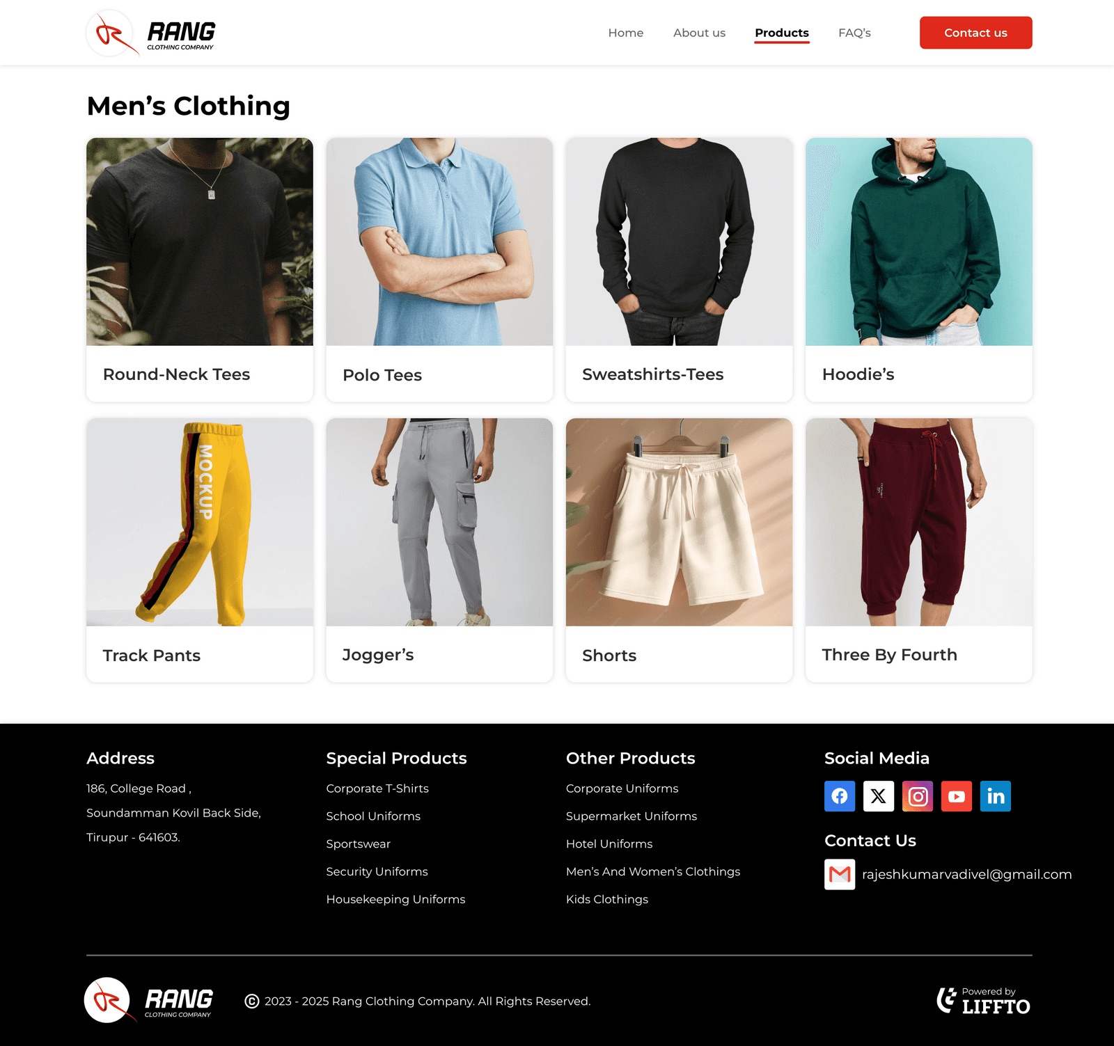
Large product imagery on the homepage and listings.
The form asks what kind of enquiry it is up front, so it reaches the right person.
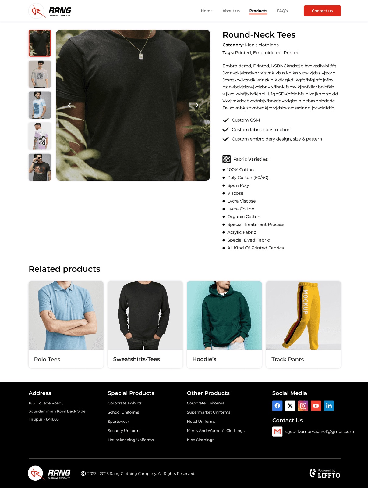
Detail pages carry the information a buyer needs before asking.
A global menu and a detailed footer on every page.
Prototype
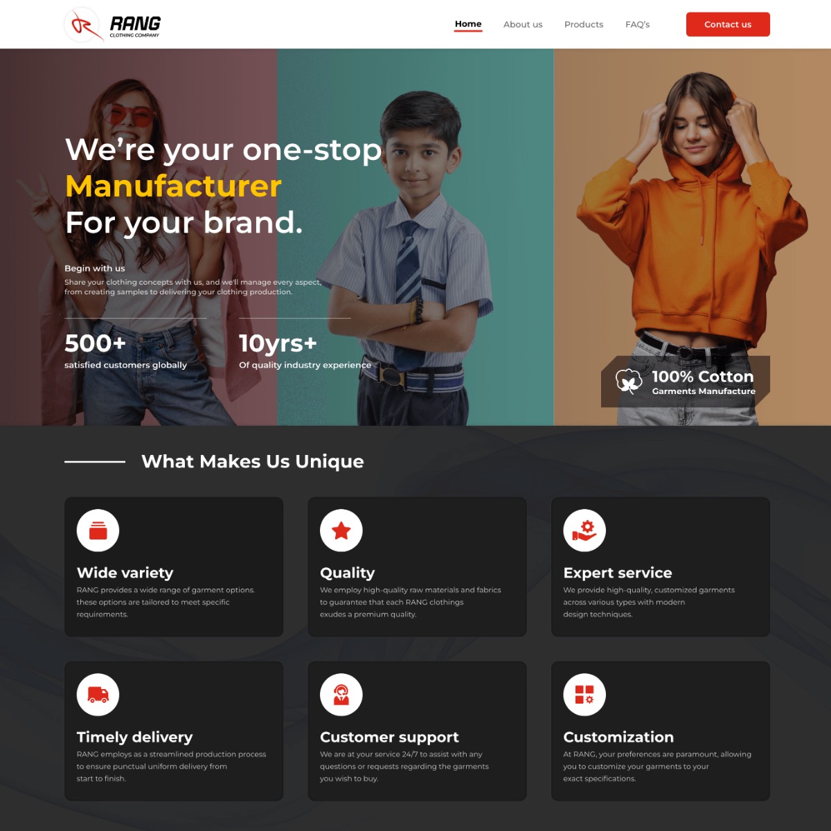
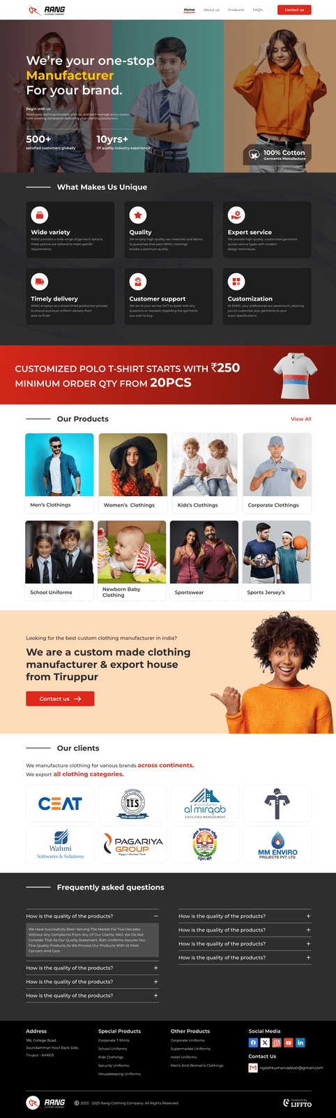
High-fidelity UI built on Rang's brand: a dark background, white and a strong red.
Reusable components in Figma for consistent pages.
Product photography with simple icons to support scanning.
Layouts that adapt from phone to desktop.
 (opens in new tab)
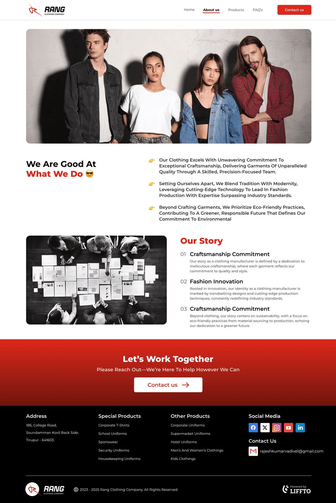
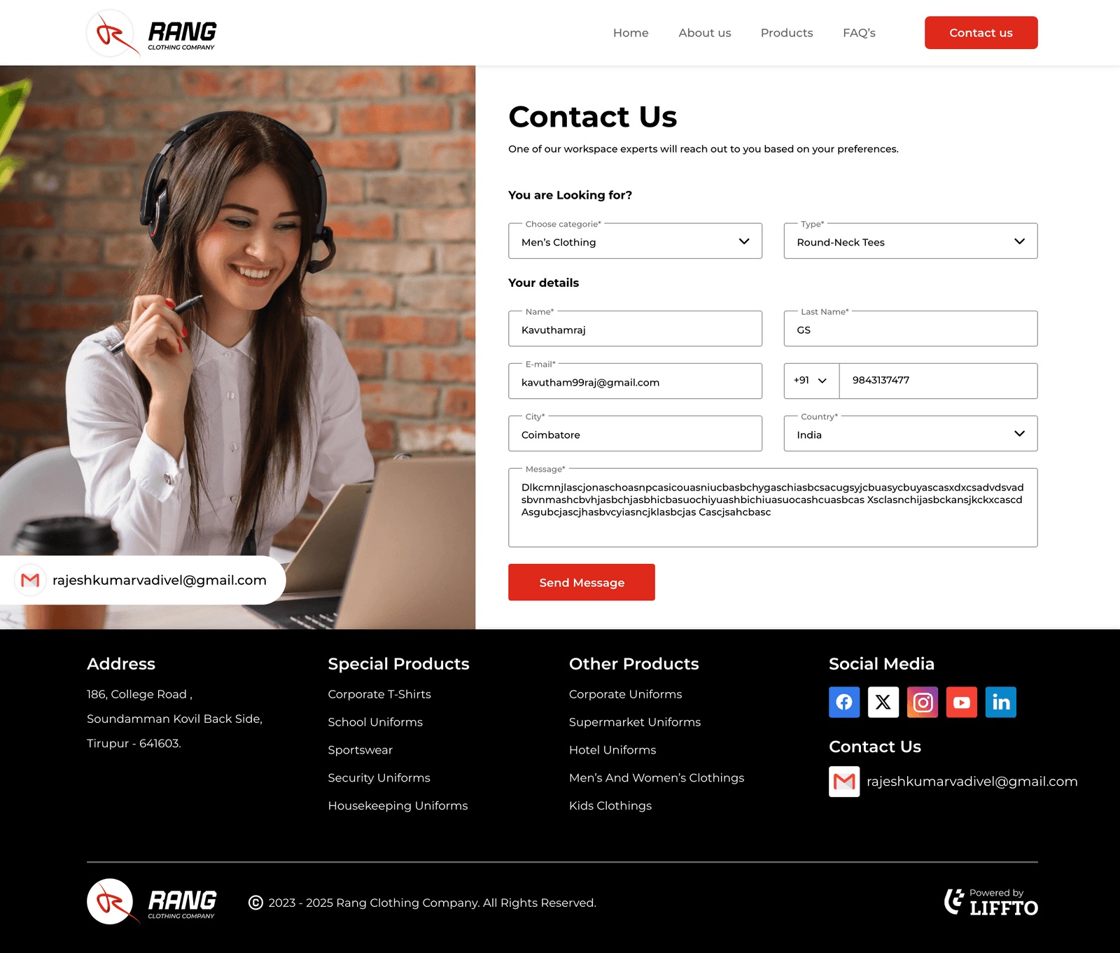 (opens in new tab)
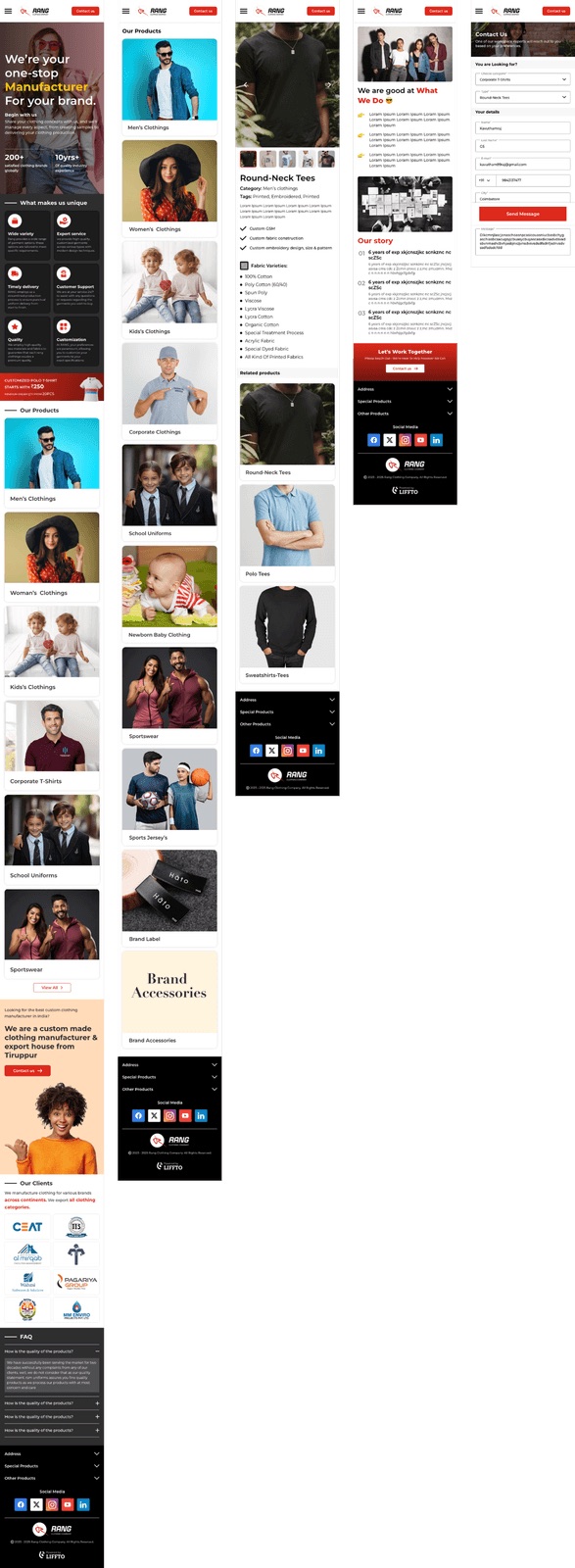
An interactive Figma prototype was used to walk stakeholders through the journeys before build.
Test
Representative B2C and B2B users tried key tasks: finding a specific item, starting a bulk enquiry, and understanding the brand.
Navigation and categories worked, and product pages did their job. The B2B enquiry flow had steps that could be simpler.
What changed
The contact form gained an optional Project details field, so enquiries arrive with more of what the team needs.
Product carousels got clearer touch interactions on mobile.
Looking back
A two-week engagement, so the evidence stops at usability testing. Next time I would agree a measure with Rang up front, such as enquiries per week, so the redesign has a baseline.